
⇒ Warning. Any strategy does not guarantee profit on every trade. Strategy is an algorithm of actions. Any algorithm is a systematic work. Success in trading is to adhere to systematic work.
Supply and demand zones are key concepts in trading, based on the idea that the prices of financial instruments are determined by the balance between sellers, who create supply, and buyers, who create demand.
These zones represent price levels where strong buying or selling activity is expected to occur, potentially having a significant impact on price movement.
Although the idea that market prices move as a result of the interaction between supply and demand may seem straightforward, identifying the corresponding zones on a chart is not an easy task. This article will help traders understand how to do it.
Learn more:
What Are Supply and Demand Zones?
Understanding supply and demand zones in trading is based on fundamental economic principles:
- When demand exceeds supply, prices generally rise.
- When supply exceeds demand, prices tend to fall.
Example. The screenshot below shows a section of a financial market chart on the left and a graphical representation of the law of supply and demand on the right.
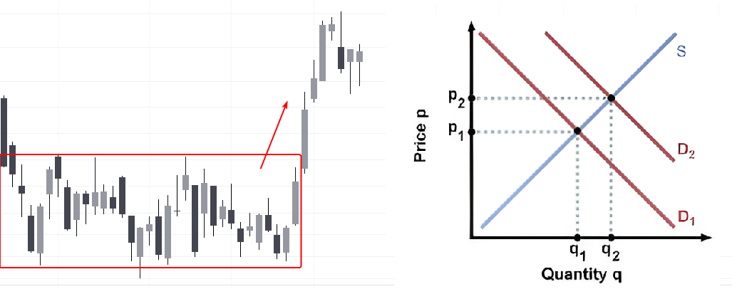
The chart shows that when the supply of an exchange-traded asset remained unchanged, represented by the S — Supply line, while demand increased, causing the demand curve to shift from D1 to D2, the asset’s price rose from Price 1 to Price 2. Trading volume also increased from Q1 to Q2.
Accordingly:
A demand zone is an area on the chart where buying interest increased strongly enough to push the price higher. The red rectangle on the chart can be considered an example of a demand zone.
A supply zone is an area where many market participants were willing to sell, eventually causing the price to decline.
Although the concept of supply and demand zones may appear simple in theory, applying it in real trading involves many subtleties and practical nuances.
How to Identify Supply and Demand Zones
There is no single universally correct method for identifying supply and demand zones.
To justify that a selected area on the chart represents an important support or resistance zone, a trader may use:
- Alternative chart types. For example, range charts ignore the influence of time and can help reduce market noise and the effects of uneven intraday volatility.
- Indicators for identifying support and resistance zones. These may include Market Profile, Stacked Imbalance, vertical volume indicators, including Delta, and other analytical tools.
Below, we will examine seven methods that can be combined to identify supply and demand zones more accurately.
Method 1. Order Block
An Order Block is a pattern used within the ICT Smart Money Concept methodology. It usually appears near a swing reversal.
It is believed that large market participants actively take part in such reversals, using available liquidity and favorable prices to build or unwind significant positions.
The Order Block pattern is therefore well suited as a model for identifying supply and demand zones. The reason becomes clearer when studying how order blocks are used in trading.
The example below shows a 30-minute Bitcoin chart based on Binance Futures data. In addition to standard vertical volume, a Delta indicator has been added to the candlestick chart.
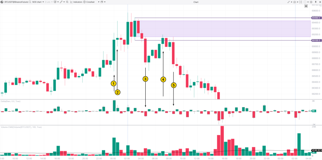
(1) This bullish candle appears strong: it has a wide body and closes near its high. However, the exceptionally high volume may be a warning sign.
(2) This is what could have raised concern. Sellers begin to show their presence above the 69K level: the candle has a long upper wick, while traces of aggressive market selling are visible in the Delta data.
Attempts to push the price higher continue, but the bullish momentum is weakening. With each new bullish candle, the price finds it increasingly difficult to reach new highs.
(3) A decline below the 69K level on increased volume, accompanied by a spike in negative Delta, indicates clear selling aggression.
At this point, there are grounds for identifying an Order Block. It is extended to the right as a price area based either on the candle body or on the candle’s full high-to-low range. On the chart, this area is highlighted in purple.
This area can be regarded as a supply zone because:
- the price found it increasingly difficult to continue rising from this area;
- selling activity is clearly visible in candles No. 2 and No. 3.
(4) The supply zone is tested.
Notice that trading volume remained relatively low as the price moved back toward the zone. This suggests hesitation among buyers and may indicate that the price could reverse downward after testing the area.
(5) This is exactly what happened: the price declined on a wide bearish candle accompanied by a spike in negative Delta.
The chart also shows a classic Head and Shoulders pattern. However, volume analysis could have provided an opportunity to enter a short position before the neckline was broken and with stronger supporting evidence.
Method 2. FVG
A Fair Value Gap, or FVG, is another concept used within the ICT Smart Money Concept methodology.
An FVG forms when the price moves rapidly upward or downward because of a significant imbalance between supply and demand.
For this reason, Fair Value Gaps can be regarded as supply and demand zones, as they reflect an imbalance between buyers and sellers.
The price often returns to such an area and performs a test, which traders may use when planning a trade.
Example. The chart below shows another 30-minute Bitcoin price chart with the same set of indicators.
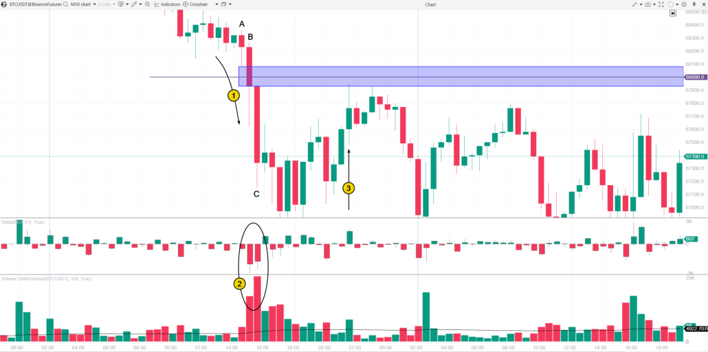
(1) As the price breaks below the psychological $68K level, sellers gain overwhelming control. This is clearly reflected in the volume indicators shown in (2).
The OHLC values of candles 1, 2, and 3 make it possible to define an FVG zone, which can be treated as a supply zone.
(3) The supply zone is tested with a spike in positive Delta. This may indicate a local buying climax, which would be more visible on a lower timeframe.
This test can be used as an opportunity to open a short position, based on the assumption that sellers continue to control the area around the psychological level.
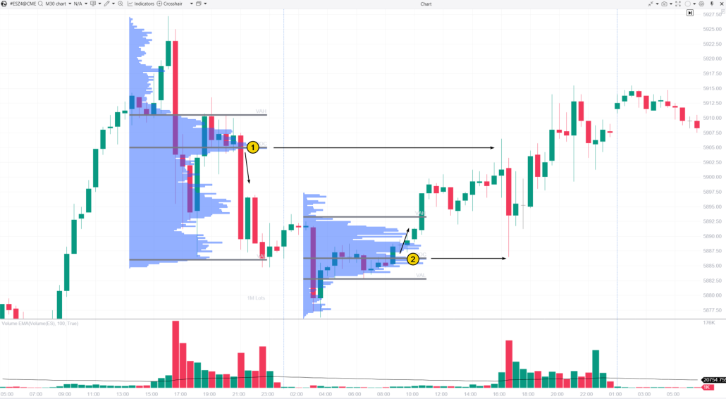
Method 3. The Wyckoff Method
The Wyckoff Method suggests analysing the stock market by evaluating the actions and intentions of the Composite Operator, representing large market participants, and their interaction with the broader mass of retail traders.
According to Richard Wyckoff’s methodology, the market consists of four main stages:
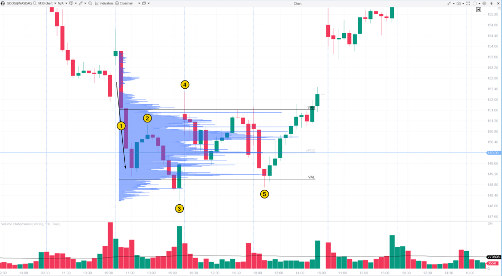
The chart above shows a short accumulation phase during which the Composite Operator accumulated shares after the price fell below $150.
(1) Selling Climax (SC). The price falls below the psychological level on wide bearish candles accompanied by increasing volume. This may have encouraged retail traders to sell emotionally or even panic-sell their positions.
(2) The rise toward this high could be described as an Automatic Rally (AR), but the trading volume remains relatively low. This looks more like a sign of weak demand than a clear demonstration of buying activity, which would normally be more characteristic of a true AR.
(3) Secondary Test (ST). The price attempts to move below the previous low but fails. A wide bullish candle near the end of the session, accompanied by high volume and a close near its high, indicates the presence of buyers.
(4) The price returns to the levels from which the panic selling originally began. After that, trading continues on below-average volume, indicating a decline in market activity. This session resembles Phase B of an accumulation stage.
(5) Another attempt to push the price below the panic-selling level also fails. The price then begins to rise confidently, suggesting that the number of sellers in Google shares is decreasing.
In such a situation, a logical continuation would be a transition into the Markup stage.
The Market Profile shows that the Composite Operator was interested in accumulating shares within the price range between VAL and VAH.
By doing so, the Composite Operator created a demand zone between $149 and $151.60, where shares were purchased from market participants who had decided to sell them.
Method 4. Market Profile Analysis
In the example above, a custom Market Profile drawing tool was added to the chart.
A versatile and powerful Market Profile indicator can be used in several ways to identify supply and demand zones. Here are a few possible approaches:
- Bulges in the profile histogram may indicate areas of supply or demand.
- A thin profile, represented by narrow sections of the histogram, may help identify zones where either supply or demand had a significant advantage.
Example. On the E-mini S&P 500 futures chart:
(1) Here, we can see price levels where trading activity was high, after which the price began to decline. Therefore, the bulge in the profile can be regarded as a supply zone.
(2) These are price levels where trading activity was also high, but the price subsequently moved upward. This means that the bulge in the profile can be identified as a demand zone.
Traders may use tests of these zones as triggers for entering positions. As the chart shows, the price tends to “bounce” when it returns to these areas.
Method 5. Footprint Analysis
A Footprint chart, also known as a cluster chart, is a highly detailed chart type that displays exchange trading activity with maximum precision.
It provides information about:
- price levels;
- trading volume;
- trade direction;
- market buys;
- market sells.
Analysing clusters, which are the smallest elements of the chart, allows traders to observe how buyer and seller activity changes over time.
This can help identify the formation of supply and demand zones.
Example. The chart below shows the BNB/USDT market using Binance Futures data.
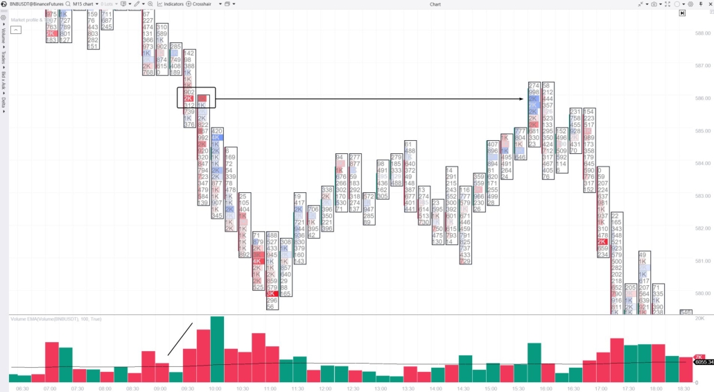
The Footprint chart with a vertical volume indicator shows the following:
At 9:30, the price began to decline, breaking below local support as trading volume increased.
Around the $586 level for BNB, strong selling activity is visible in the bright red clusters highlighted by the rectangle. This seller activity indicates the formation of a resistance zone near $586.
Six hours later, the price tested this zone.
In this case, the blue clusters accompanied by increased vertical volume provide additional confirmation for the assumption that the price may reverse downward.
Method 6. Alternative Chart Types
The platform allows users to build different chart types based on tick data.
For example, traders can use a range chart to examine price movement from a different perspective.
Range charts ignore the time factor and create a new candle only after the price moves by a specified amount. This provides a distinctive method for identifying supply and demand zones.
Example. The NQ futures market.
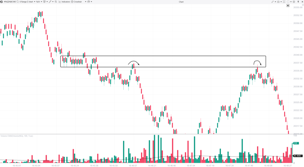
The range chart shows that, for a certain period of time, the price fluctuated within a narrow range around the 20,337.50 level. This indicated a temporary balance between supply and demand.
After that, the price began to decline, suggesting that sellers had gained the advantage.
Therefore, the area highlighted by the rectangle can be regarded as a supply zone.
The chart also shows that a test of this zone could have served as a signal for opening short positions in anticipation of a downward reversal, as indicated by the arrows.
Method 7. Liquidity Analysis
Finally, let us consider a simple method for identifying supply and demand zones using Level II data and analysing orders in the order book.
This method is based on the following logic:
- The greater the concentration of limit buy orders, the stronger the argument for treating the area where those orders are placed as a demand zone.
- If there is a cluster of large buy orders, there are sufficient grounds to consider that area a demand zone.
Example. A DOM Levels indicator highlights price levels where large limit orders have been placed by using bright colours directly on the chart.
The BTC/USDT chart below shows how this works:
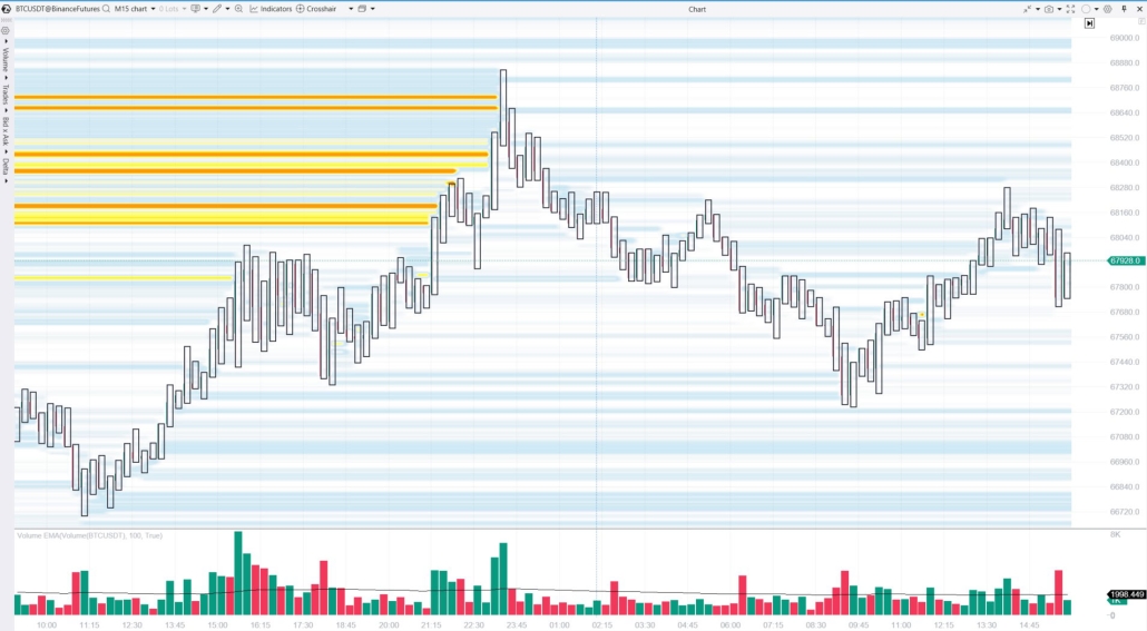
The bright yellow-orange levels represent traces of large sell orders placed below the 68,700 level.
Together, these sell orders acted as a supply zone, stopping Bitcoin’s upward movement and pushing the price lower.
How to Mark Supply and Demand Zones
This is largely a matter of personal preference.
A trading platform may provide a range of drawing tools that can be used to mark supply and demand zones, including:
- horizontal levels and rays;
- rectangles;
- horizontal range-highlighting tools, which may be one of the most convenient options.
Traders can also set alerts on horizontal levels to receive notifications when the price approaches a specific area. This helps ensure that tests of supply and demand zones are not missed.
How to Trade Supply and Demand Zones
Working With Charts
Trading supply and demand zones begins with identifying them. The seven methods described above may be used for this purpose.
It is important to work with clean and simple charts, preferably using layouts with only a small number of indicators and distracting elements. This makes it easier to focus on changes in supply and demand.
Strategies and Rules
The basic supply and demand trading strategy involves:
- buying an asset in a demand zone in anticipation of a price increase;
- selling an asset in a supply zone in anticipation of a price decline.
Traders can implement this approach by following these steps:
- Identify a supply or demand zone based on convincing evidence.
- Mark the zone on the chart.
- Wait for the price to test the zone.
- Look for confirmation that the test is likely to succeed and that the price may reverse.
- Open a position in the direction of the expected reversal.
Risks
Trading supply and demand zones involves risk, so effective risk management must be an essential part of the strategy.
The trading plan should include both stop-loss and take-profit orders.
Stop-loss orders should generally be placed beyond the boundaries of the zone. Additional indicator data from lower timeframes may be used when it is necessary to reduce risk or define a more precise entry.
The take-profit target should be set so that the potential reward is at least equal to the potential loss.
For example, suppose a trader opens a long position when the price tests a demand zone. In that case, a supply zone located above the entry may be used as a potential profit target.
FAQ
What Is the Difference Between Supply and Demand Zones and Support and Resistance?
Supply zones act as resistance, while demand zones act as support.
These concepts are similar in nature and complement each other.
How Can Supply and Demand Zones Be Identified?
Changes in the balance between buyers and sellers create characteristic price patterns on the chart and may also appear in indicator signals.
Supply and demand zones can be identified using methods such as:
- Market Profile analysis;
- Smart Money Concept patterns;
- Footprint and cluster analysis;
- volume analysis;
- Order Blocks;
- Fair Value Gaps;
- order book and liquidity analysis.
What Are Supply and Demand in Trading?
Supply and demand are fundamental concepts used to explain why market prices fluctuate.
By analysing trading volume and using other market assessment tools, traders can observe how buying and selling forces interact, including in real time.
This may improve the chances of trading in line with the dominant market force.
Conclusion
Supply and demand zones provide important information about potential price reversal areas in the market.
Advantages of Supply and Demand Zones
Versatility
Supply and demand zones can be applied in different market conditions and across various markets, including:
- stocks;
- futures;
- cryptocurrencies;
- currencies;
- commodities.
Volume-Based Approach
The assessment of supply and demand is closely connected to the interaction between price and trading volume.
Consideration of Major Market Participants
The strongest zones often form as a result of activity by institutional investors, large hedge funds, and other major market participants capable of influencing prices.
Risk Management
This approach may help reduce risk by allowing traders to place stop-loss orders beyond the boundaries of supply and demand zones.
Disadvantages of Supply and Demand Zones
Supply and demand zones often appear obvious when viewed on historical charts.
However, identifying them in real time requires experience and a deep understanding of market mechanics.
Other disadvantages include:
Complexity
The combined effect of supply and demand is influenced by many different factors.
Constant Change
Supply and demand are highly sensitive to how market participants emotionally perceive prices. This may lead to irrational behaviour and rapid changes in market conditions.
Dependence on the Timeframe and Trading Style
The interpretation of zones may vary depending on the selected timeframe and whether the trader uses a conservative or aggressive approach.
Lack of Reliability
Even a supply or demand zone that appears strong may be broken by a new and powerful price impulse.
High Degree of Subjectivity
Different traders may identify the boundaries of the same supply or demand zone differently.
The zones shown in the examples above may therefore be interpreted in another way by a different trader.
Is Trading Supply and Demand Zones Profitable?
Trading supply and demand zones may be profitable if a trader:
- learns to identify the zones accurately;
- develops a trading plan that accounts for both risk and potential reward;
- remains disciplined;
- follows the trading plan consistently.
supply and demand zones, supply and demand zones in trading, how to identify supply and demand zones, supply and demand trading, demand zone, supply zone, supply and demand levels, supply and demand analysis, supply and demand strategy, support and resistance, support and resistance zones, Order Block, Order Block trading, Fair Value Gap, FVG trading, ICT Smart Money Concept, Smart Money Concept, Wyckoff Method, Wyckoff accumulation, Composite Operator, Selling Climax, Secondary Test, Automatic Rally, Market Profile, Market Profile analysis, Footprint chart, Footprint trading, cluster chart, cluster analysis, Delta analysis, vertical volume, volume analysis, Level II data, order book analysis, DOM Levels, liquidity analysis, limit orders, liquidity zones, range chart, alternative chart types, volume trading, institutional traders, large market participants, demand zone entry, supply zone entry, demand zone test, supply zone test, stop loss beyond the zone, take profit, risk management in trading, trading strategy, technical analysis, order flow analysis, Bitcoin supply and demand zones, crypto supply and demand zones, futures supply and demand zones, stock supply and demand zones
![]()