
⇒ Warning. Any strategy does not guarantee profit on every trade. Strategy is an algorithm of actions. Any algorithm is a systematic work. Success in trading is to adhere to systematic work.
Behind every trade in the market, there are two types of orders. Limit orders are placed in advance: “I will buy at 5700, but not higher” — and then the trader simply waits. These orders sit in the order book and form the market’s passive liquidity. Large players often operate specifically through limit orders, which is why zones where they concentrate become important levels on the chart. Market orders are used when a trader wants to enter immediately and agrees to the best available current price. They do not wait — they hit the liquidity already sitting in the order book and push the price forward.
A candlestick chart shows only the result of this collision. Order flow shows the collision itself: who was pushing, who was holding, and how it ended.
A heatmap is a visualization of the limit side of the market over time. It is not a snapshot of the order book at one specific second, but its full history: where large volumes accumulated in advance, where they were pulled at the last moment before price touched the level, and where they actually held under the pressure of market orders. The denser the limit orders at a level, the brighter that level appears on the map.
A candlestick can never show this. It only records what has already been executed. A heatmap shows what is sitting in the order book right now — and how that picture changed while price was moving toward the level.
Let’s clarify one thing right away: on some platforms, the word “heatmap” is used to describe a broad overview across many tickers — which stocks are rising and which are falling. That is a different tool with different logic. In ATAS, we are dealing with a market depth heatmap visualization — a colored version of the order book for a specific instrument, where liquidity accumulation and absorption can be seen in real time.
Next, we will break down what a heatmap is and how it works, how to read colors and volume bubbles, how real liquidity differs from fake liquidity, which four patterns are worth knowing, and how all of this works in ATAS together with the footprint, delta, and volume profile.
What Is a Heatmap in Trading?
A heatmap is a separate module for analyzing price movement, where liquidity is displayed through color. Where many limit orders have accumulated in the order book, the color markers are brighter. Where there are fewer orders, the colors are less intense. This is shown across the entire price scale in real time.
Heatmap vs. Candlestick Chart.
A heatmap works like a thermal camera. The device distinguishes objects by temperature where the naked eye sees only darkness. A heatmap does the same with limit orders — it displays liquidity where a regular chart shows only the price at which trades were executed.
Heatmap vs. DOM (Level 2).
A heatmap and the order book show the same thing — limit orders in the book. The difference is that the DOM shows bid and ask liquidity only at the current moment, like a snapshot. A heatmap unfolds that same picture over time, like a dashcam. You can see how liquidity at a level changed as price approached it: where it accumulated, held, or was pulled before the touch.
This does not mean one tool is better than the other — they naturally complement each other. Candles show the structure of price movement, the order book shows the current liquidity picture, and the heatmap shows its history. Together, they give the trader more context for decision-making. In ATAS, you can flexibly build a workspace around your strategy: combine the Heatmap module with footprint charts, the order book, widgets, or a Watchlist in one window to see the most complete market picture possible.
A heatmap works equally well for futures, stocks, and crypto. On crypto exchanges, the available market depth depends on your connection settings. On CME, access to full market depth usually requires a separate data subscription. Check with your broker or data provider to see what is included in your plan — what you see on the heatmap when analyzing stocks or futures directly depends on the quality of your data feed.
How the Heatmap Works
The mechanics are simple. Price is shown on the vertical axis, and time is shown on the horizontal axis. The more limit orders there are at a particular price at a specific moment in time, the brighter the marker.
The map updates together with the order book in real time. New limit orders appear at a level — the marker becomes brighter. Orders are pulled — it becomes dimmer. Market orders absorb the limits — the same thing happens: the level loses intensity because there is less liquidity there.
Important Nuance
The brightness of a marker tells you only one thing: there are currently many limit orders at that level relative to nearby levels. It is not a guarantee of a reversal or a price reaction. What happens next depends on how that liquidity behaves when price approaches the level.
How to Read Heatmap Colors
The specific colors depend on the selected palette — and ATAS has more than twenty of them. But the principle is always the same: a saturated color means a high concentration of limit orders at that level; a dim color means a low concentration. The logic is the same, only the shades differ.
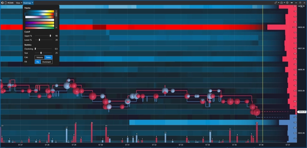
The palette is a matter of personal preference. Some traders read warm tones better — from dark shades to yellow and white. Others prefer cooler tones — from dark blue to light blue. The key is that the gradient should be comfortable for your eyes: in an active market, you may spend hours looking at the map, and color fatigue is a real issue.
Important Nuance
Color intensity shows the density of orders, but it does not mean that price will necessarily react to the level. Orders can be pulled at any moment — especially large ones, which are precisely what create the brightest zones on the map.
Volume Bubbles: How to Read Executed Trades
Against the background of the heatmap, you see the passive side of the market — limit orders in the order book. Bubbles, on the other hand, represent the active side: market orders that absorb those limit orders. Each bubble represents trades executed at a specific level over a certain period of time.
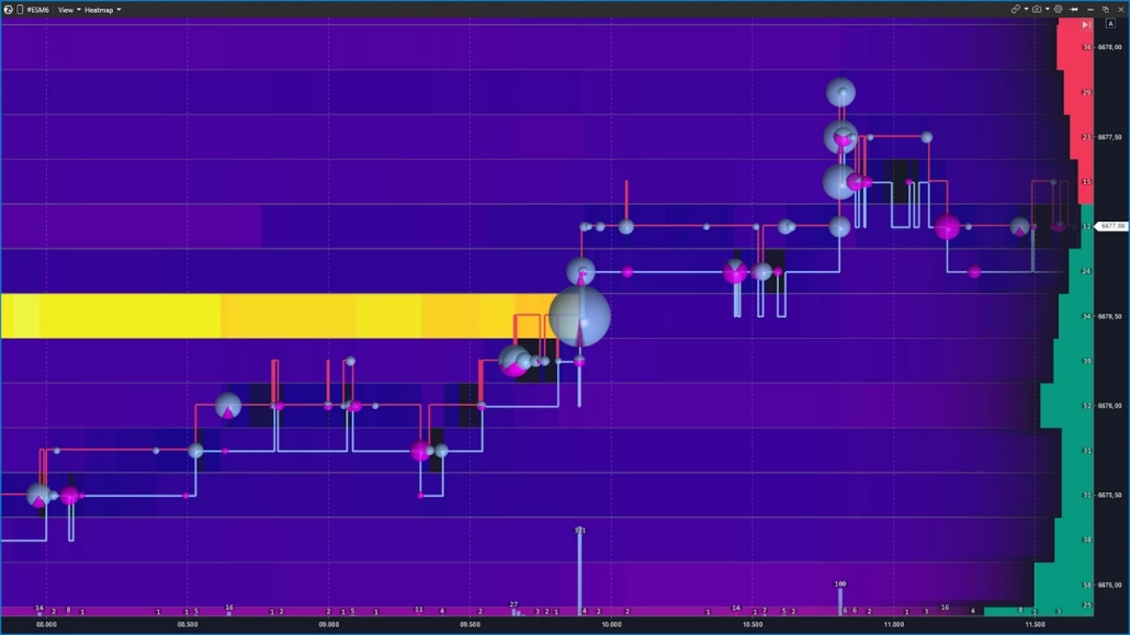
The size of a bubble reflects volume: the larger the trade, or the series of trades in one direction, the larger the bubble. The color shows the direction of aggression — whether buyers were hitting the Ask or sellers were hitting the Bid. The specific colors depend on your settings, but the logic is always the same: two sides, two colors.
The most interesting moment happens when a large bubble appears directly on a bright heatmap level. This can mean one of two things:
either the aggression is being absorbed by limit orders and the level is holding;
or there are no longer enough orders there, and price breaks through the level.
This exact combination — the bubble plus the behavior of liquidity — is the foundation of order flow heatmap trading.
Heatmap Components
A heatmap is not a single standalone indicator of market conditions. Its strength comes from overlaying three layers at once. Below are the three pillars in ATAS terminology: DOM, session volume profile, and delta — all used together with the heatmap.
DOM: Where Liquidity Is “Right Now”
In ATAS, there are several order book visualization modes: the multifunctional Smart DOM, as well as the DOM Trader and DOM Levels indicators, which can also operate in heatmap mode. In the Heatmap module, the order book is presented in the most concise form — only the key order information that matters in the context of liquidity analysis.
Order book information is displayed directly on top of the heatmap. To the right of the price axis, you can see horizontal rectangles extending deeper into the screen to the left:
red rectangles above the current price represent the Ask — limit sell orders that form resistance;
green rectangles below represent the Bid — limit buy orders that form support.
The more limit orders there are at a level, the longer the rectangle.
The current price runs across the entire screen as an invisible line, dividing it into two sides. Price moves up when market orders absorb the Ask. It moves down when pressure is applied to the Bid.
Important
Orders appear and disappear from the order book instantly. Trading only by looking at the order book snapshot, without observing how liquidity behaves as price approaches a level, is one of the most common mistakes.
Volume Indicator: Context for Each Candle
The Volume indicator is displayed below the heatmap as vertical bars — one for each candle. The height of the bar shows the trading volume for that period. The color shows direction: the bars are colored by delta, meaning they reflect whether buyers or sellers had the upper hand during that same interval.
A volume spike on a bar is a reason to pause and look at the heatmap: what was happening at the nearest levels at that moment? Did the liquidity hold, or was it absorbed?
In the settings, you can switch the data source: total volume, only asks, only bids, or tick count. This allows you to isolate one side’s aggression and examine it separately from the overall flow. When used together with the heatmap, the Volume indicator answers the question: when exactly was the market active — and who was applying stronger pressure at that moment?
Cumulative Delta — Which Side Holds the Aggression

Delta is the difference between aggressive buying and selling in each bar. Cumulative delta adds this imbalance cumulatively and shows how the balance of aggression shifted throughout the entire session.
Why is this needed next to the heatmap? A bright level on the map represents a concentration of limit orders. But without confirmation, it may turn out to be a fake signal. Cumulative delta adds the missing data layer: if buyers were pressing for several bars in a row, but price failed to move higher near a wall of limit sell orders, this is a reason to consider an absorption scenario — large limit orders were holding back buyer pressure.
This is why in ATAS, the heatmap is rarely used in isolation. When combined with cumulative delta, it reveals the full picture: where liquidity was standing — and who was pressing against it, with what force, and for how long.
How to Distinguish Real Liquidity from Fake Liquidity
A heatmap shows what is currently present in the order book. But the presence of an order does not guarantee that it will be executed.
Large players may sometimes place a large order to create a desired psychological effect. But when price approaches the level, they quickly cancel the order. This is called spoofing.
What Is Spoofing?
Spoofing is the placement of large orders in the order book to create a desired market movement, followed by canceling those orders before execution. It is prohibited on traditional exchanges and monitored by regulators. In crypto markets, the level of oversight depends heavily on the jurisdiction and the platform, so it occurs much more often there.
This is not paranoia and not a conspiracy theory. It is a market mechanic that traders need to understand in order not to trap themselves with their own analysis.
Below are two scenarios that illustrate fake and real liquidity: how it appears on the map and what happens when price touches the level.
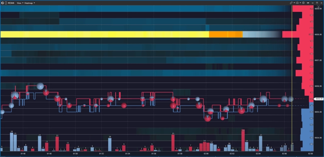
Imagine this: a huge wall appears in the order book — thousands of contracts at a single level. Some traders see support and start buying. Others see resistance and close their short positions. The market moves in a predictable direction. As soon as the desired effect is achieved, the order is removed. That is spoofing.
On the heatmap, spoofing looks like this: a bright zone appears in advance, remains visible as price approaches, and then disappears at the last moment — before price touches it. For example, price is moving toward a support zone at 6520, where the map shows a dense cluster of limit buy orders. But as price gets closer, the zone fades and disappears — price passes through the level without any reaction because there is nothing left behind it. The same thing happens with levels around 6518 — they are removed in a similar way before price drops.
Another typical sign of fake levels is the absence of large market sell trades. If there were real strong support at that level, breaking it would require many market sell orders hitting at once — and these would appear on the chart as large Bubble circles with a red imbalance.
How to Recognize Fake Liquidity
1. A bright zone appears in advance, but disappears just before price touches it.
2. Price moves through the level without volume bubbles — there was no real aggression.
3. Delta does not confirm the move — if the level were real, breaking it would require significant one-sided aggression.
That is why experienced traders do not rush to act the moment they see a bright level on the map — they wait for price to reach it and reveal what is actually happening. A bright zone is only a hypothesis. Confirmation comes from the touch, the volume, and the behavior of price afterward.
Real Liquidity: Absorption and Price Reaction
Real liquidity is when an order remains in the order book, price reaches it, the orders are executed, and the market reacts. The level holds, price bounces, or reverses. This is absorption in action.
How can you distinguish a real level from a fake one? There are three signs at the moment of the touch:
Signs of Real Liquidity: Absorption
✓ The bright zone holds as price approaches — it does not fade or disappear.
✓ Large volume bubbles appear directly at the level — aggression hits the limits, but price does not move further.
✓ Delta diverges from price movement — for example, buyers are pressing, but no new highs are formed.
All three together create a strong context for an absorption hypothesis. One out of three is a reason to observe, but not enough to draw a conclusion.
The main rule here is simple: what matters is not where the orders are standing, but how price behaves when it reaches them. The heatmap shows where. Volume and delta show what.
Heatmap Trading Setups: Four Patterns
A heatmap does not provide ready-made entries — it provides context. Below are four recurring scenarios that traders use as a basis for analysis. Each of them requires confirmation: price behavior, volume, and delta. Without that, any pattern remains just a picture on the screen.
Absorption — The Level Holds
Aggressive market orders are pressing into the level, but price fails to break through it. The bright zone on the heatmap holds. Volume bubbles appear directly at the level — large and one-sided. Delta diverges from price movement.
In a bullish scenario, sellers are hitting the Bid, but price does not move lower — limit buy orders absorb the aggression. In a bearish scenario, the picture is mirrored.
Traders who work with this pattern usually monitor price behavior after the first touch of the level. If the level is broken, the absorption hypothesis has not been confirmed.
Exhaustion — The Impulse Comes to an End
Unlike absorption, there is no strong opposing wall here. The aggression simply dries up: volume bubbles become smaller with each bar, price slows down, and stops in a low-liquidity zone on the heatmap.
In a bullish scenario, large bubbles are replaced by smaller ones, and price stops making new highs — the fuel has run out. In a bearish scenario, the picture is mirrored.
Traders who work with this pattern track the gradual decrease in bubbles as confirmation that the impulse is running out of energy, rather than simply pausing.
Iceberg: Hidden Size at the Level
![]()
The visible size of the order in the book is small, but the level does not disappear — it keeps refreshing as executions occur. Price returns to it again and again, volume bubbles keep printing, and the limit order seems as if it is not being depleted.
The hypothesis: there is a large participant behind the level who is splitting the order into smaller parts, hiding the real size. It is impossible to confirm an iceberg using only the heatmap. In ATAS, several additional tools are used together with heatmap levels for this purpose:
Footprint — shows the execution structure inside each bar. If large volume keeps printing at the same level again and again while price does not move away, this can be seen in the bid/ask breakdown inside the candle.
Smart Tape — if large prints of approximately the same size keep appearing at the level, this is an indirect sign of algorithmic execution filling hidden volume.
TTW Iceberg Detector — a specialized indicator from our partners for those who systematically hunt for icebergs.
Liquidity Sweep: Stop Hunting
Price sharply breaks through a known level, collects stops and limit orders, and then quickly returns back. On the heatmap, this appears as a fast spike through a bright zone, many volume bubbles on the breakout, and a sharp reversal.
This pattern is most often observed in futures at the beginning of a session or around macroeconomic data releases. Traders who work with liquidity sweeps usually wait for price to return back through the broken level and then monitor how liquidity behaves during that return.
Liquidation Heatmap: A Different Type of Data for Crypto
⚠️ These are two different tools. A liquidation heatmap and an order book heatmap have different data sources, different reading logic, and different conclusions. They should not be used interchangeably.
A liquidation heatmap does not show limit orders in the order book. It displays zones where leveraged margin positions have accumulated — positions that the exchange will forcibly close if price reaches them. Large liquidation zones above the current price often act like magnets: the market is drawn toward them to collect stops and liquidate longs. But this is not support or resistance in the classic sense — it is a map of potential forced liquidations.
ATAS does not have a pure liquidation heatmap built in. For that, traders usually use third-party dashboards such as Coinglass, Hyblock, and others. However, ATAS does provide tools that allow traders to build similar analytics on their own.
Example Workspace for Liquidation Analysis
Heatmap — zones of liquidity concentration in the order book and how they behave as price approaches them.
Aggregated Liquidations — aggregated liquidation data for the instrument.
Coinglass Open Interest — open interest data from Coinglass. Rising OI while price is rising indicates new positions are being opened; falling OI while price is falling points to liquidations.
CVD — cumulative volume delta for tracking the balance of aggression.
Volume — volume for each candle, broken down by delta.
Please note: the Aggregated Liquidations and Coinglass Open Interest indicators are not available for all crypto instruments.
Heatmap and Footprint in ATAS: Why You Need Both Layers
A heatmap is good at showing where liquidity is positioned. But it does not answer the question of what happened inside the bar at the moment price touched the level. This is where the Footprint comes into play.
ATAS is a specialized platform for footprint analysis, offering more than 400 variations of cluster charts. The footprint shows the distribution of volume between Bid and Ask inside each candle at the level of individual price ticks: who was applying pressure, with what force, and exactly where that aggression met resistance.
The working sequence looks like this:
Context:
Use the Heatmap to identify the area of interest: where liquidity has accumulated and how it behaves as price approaches.
At the moment of the touch:
The Heatmap shows whether the wall holds as price approaches. If the density holds, open the Footprint on a timeframe from M5 to M30 depending on your preference, and analyze the execution structure inside the bar: evaluate delta by price levels, imbalances, and absorption.
Hypothesis execution:
After entry, the Heatmap helps track whether new limit density has appeared that was not present during the planning stage. The Footprint shows how the execution structure changes as the scenario develops. If the picture changes, it is a reason to pause and reassess the scenario — not to continue acting on inertia.
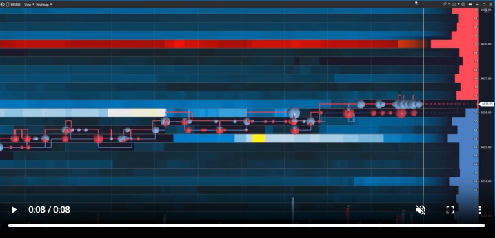
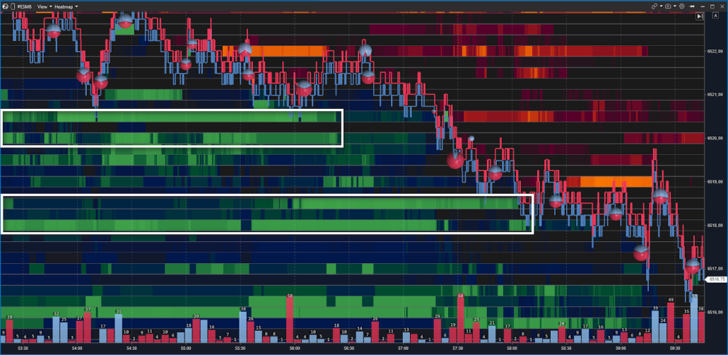
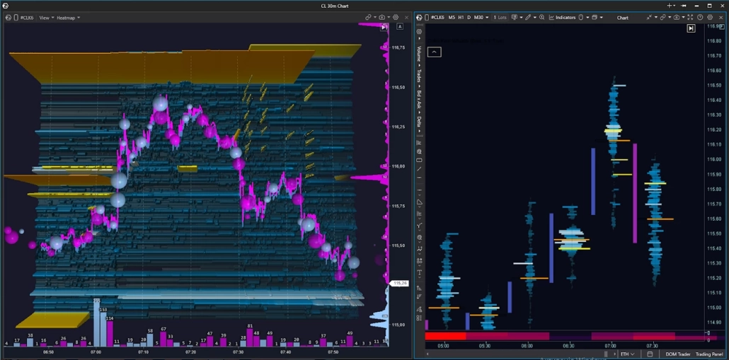
How to Read a Heatmap: Chart Examples
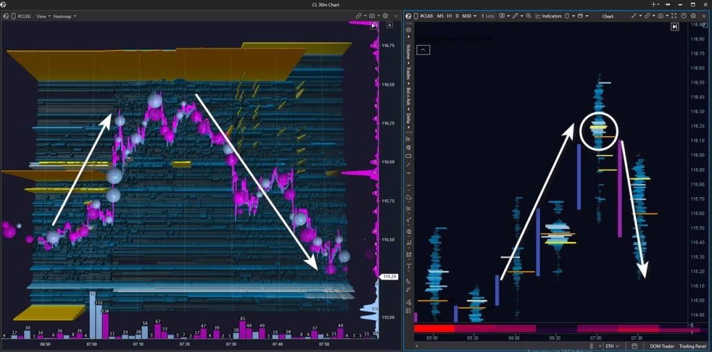
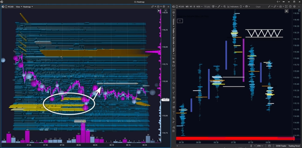
We are analyzing a real situation on the CL crude oil futures contract. The setup combines Heatmap + Footprint on the M30 timeframe. Context: an intraday uptrend.
As price moves higher, several zones with large clusters of limit sell orders are visible on the chart — potential resistance zones.
Price breaks through the first yellow zone with momentum and holds above it — buyers are in control. Then price approaches the next major level on the heatmap and stalls in front of it. After a pullback and a second attempt to break through the level, a decrease in buyer pressure becomes visible: the blue bubbles become smaller — buying aggression is fading.
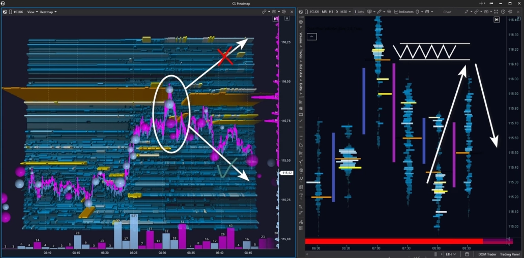
In the next segment, price moves lower under seller pressure — pink bubbles dominate. Price drops below the previous limit level that buyers had broken through earlier. If a seller was indeed positioned there, their position is now moving into profit.
At this point, we look at the cluster chart. A fresh absorption cluster appears there — and price reacts with a downward impulse. All the signs are present: buyer weakness, seller strength, and absorption of buying aggression by limit sell orders. The intraday uptrend is now in question.
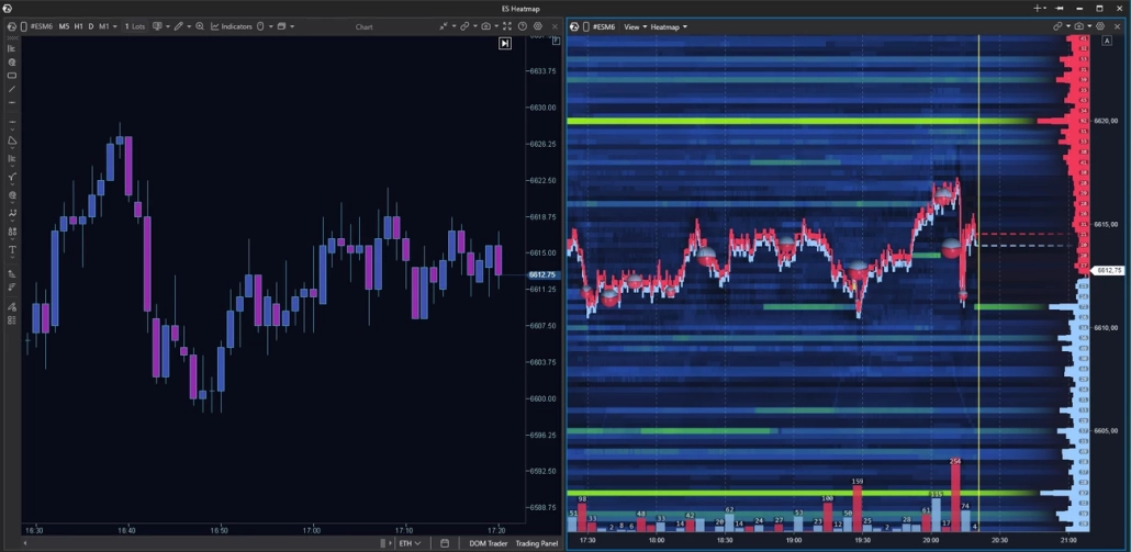
After the downward impulse, price runs into a zone of limit buyers — the seller is applying pressure, but cannot break through support, and the market moves into a narrow range.
What is more interesting is something else: a fresh limit seller zone has appeared above, which was not there before. It is holding firmly in place and looks like a potential resistance zone within a developing downtrend. The next step is to wait for a test of this zone in order to assess who proves stronger at the touch.
Price tests the seller zone — large buy bubbles appear, but there is no breakout. The bounce downward is immediate: buying aggression has been absorbed. On the footprint chart, a fresh seller cluster is visible — and the price reaction confirms that the seller is defending it. Price moves lower.
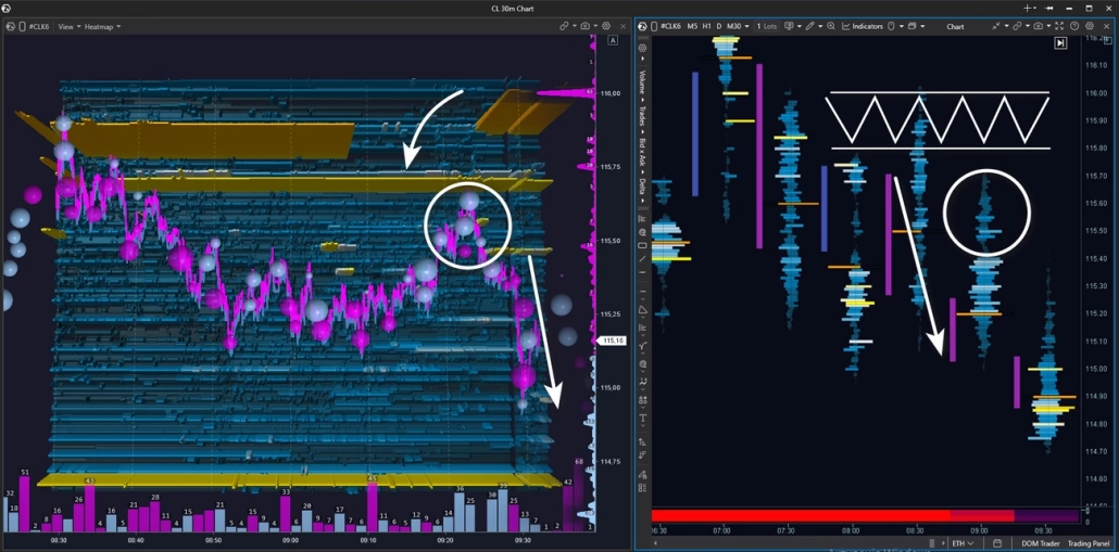
After the bounce and a short consolidation, price reverses and moves toward the limit resistance zone again. But this time, buyers fail to reach the level — there are no market buys, no pressure. Price stalls on its own and turns downward: buyer support is gone.
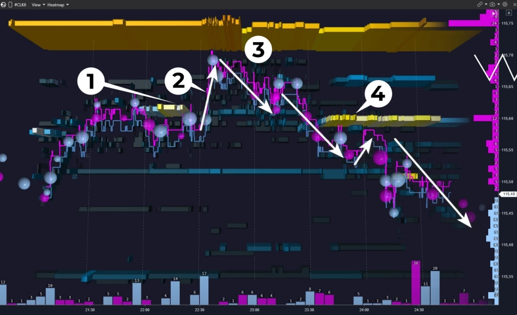
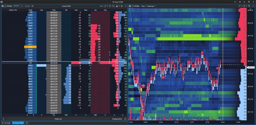
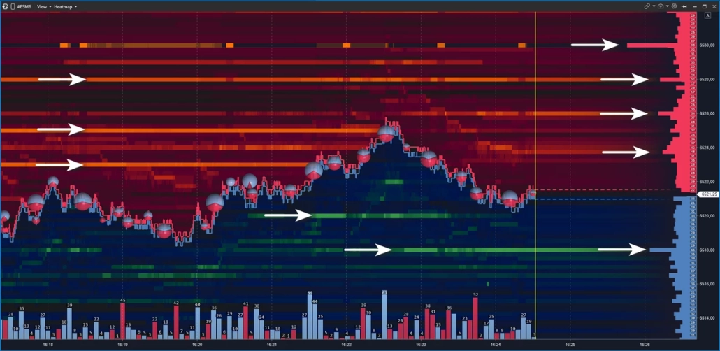
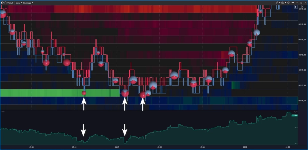
Let’s examine the seller zone retest in more detail by zooming in on the heatmap.
At point 1, a limit seller level appears. At point 2, price breaks through it upward — the aggressive buyer is still in control.
At point 3, the picture changes: price begins to drift lower, and there are no large market buys — there is no one left to push price higher. At point 4, a fresh strong seller level appears. This is not just downward pressure — the seller is marking a resistance zone that they are ready to defend with limit orders.
After several small tests of this zone, the decline continues.
This pattern repeats regularly and gives traders a chance to find an observation point even during an already directional move. For those who missed the entry on the test of the main level, it can provide an additional opportunity to join the move with confirmation.
And one more important point: every hypothesis has an invalidation point. It is important to define your stop-loss and take-profit levels in advance — before price reaches the zone. If the level is broken and liquidity fails to hold price, the scenario has not played out, and the stop confirms that fact with minimal damage to the trader.
5 Common Mistakes When Working with a Heatmap
A heatmap is a powerful tool. But there are several persistent mistakes that can completely undermine its potential.
1. Entering a Trade from Every Bright Zone
Many large zones on the map become invalid over time — they are pulled or moved before price ever reaches them. Brightness indicates a concentration of liquidity, but it does not mean that liquidity will remain there.
2. Reading the Heatmap Without Context
Without the structure of the higher timeframe and the volume profile, the heatmap turns into a set of colored stripes. A level must make sense in the context of the daily range, POC, and balance — otherwise there is nothing meaningful to analyze.
3. Confusing a Liquidation Heatmap with an Order Book Heatmap
These tools have different data sources, different reading logic, and different conclusions. We discussed this in more detail above.
4. Reading Color Without Delta
A bright zone in the order book is only half the picture. If aggression does not confirm what the heatmap is showing, the wall may turn out to be just decoration. Delta is what turns observation into a hypothesis.
5. Zooming In Too Much
A tick-level heatmap in an active market creates visual chaos. Start with a scale where the levels are clearly readable, and only then adjust the depth.
BT
![]()