⇒ Warning. Any strategy does not guarantee profit on every trade. Strategy is an algorithm of actions. Any algorithm is a systematic work. Success in trading is to adhere to systematic work.
LOGIC OF THE WYCKOFF METHOD
The Chart Contains All Necessary Information
Wyckoff argued that all the information needed for making trading decisions is already reflected in the prices and trading volume indicators shown on the chart (in those days, charts were constructed manually). The advantages of this approach are:
- the chart consolidates all trades and presents a kind of consolidated report;
- the chart does not lie and serves as a reliable source of actual exchange information;
- the chart allows for real-time information analysis (as much as the realities of the 20th century allowed).
The Composite Operator
Wyckoff believed that various groups of major players often act in a similar manner without colluding with each other. Thus, he introduced the concept of the Composite Operator into his method—a hypothetical market participant representing those who can influence the market with their large transactions.
Three Key Laws of the Wyckoff Method
For reading the price and volume chart, Wyckoff used three laws:
- The Law of Supply and Demand. Determines the direction of price movement based on the balance (imbalance) between buyers and sellers.
- The Law of Cause and Effect. This means that price growth is a consequence of the asset being previously accumulated by the Composite Operator. Accordingly, distribution is the cause of a subsequent price decline.
- The Law of Effort and Result. Analyzes the relationship between trading volume (effort) and price change (result) to assess the successes and failures of market participants, which helps to identify prevailing market sentiment.
FOUR STAGES OF THE MARKET CYCLE IN WYCKOFF THEORY
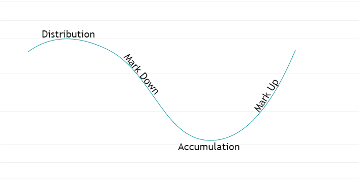
Based on his observations, Wyckoff identified four main stages of the market cycle:
- Accumulation,
- Mark Up (price increase stage),
- Distribution,
- Mark Down (price decline stage).
Chart:
- Shows the four stages in a curve passing through Accumulation, Mark Up, Distribution, and Mark Down stages.
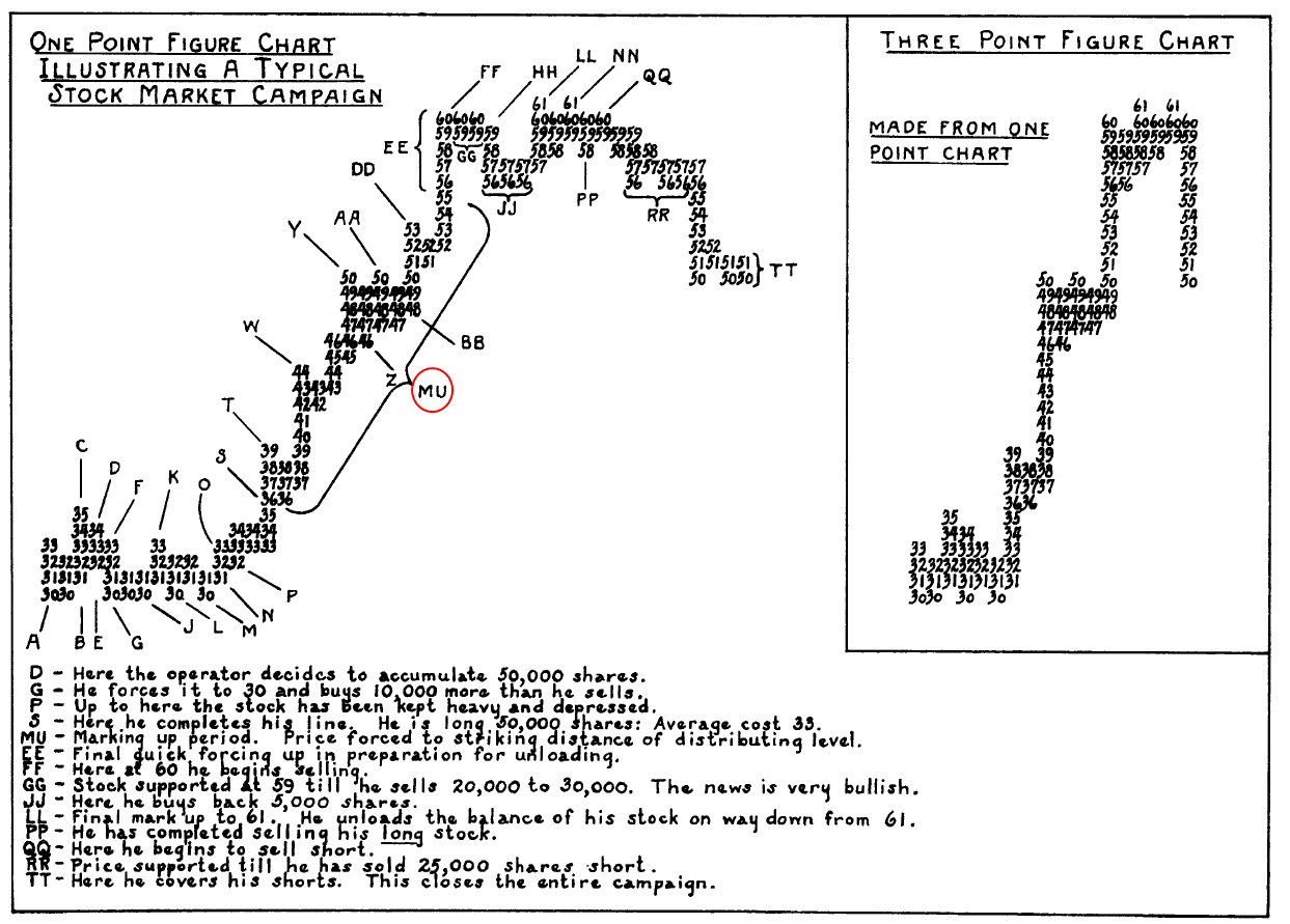
Richard Wyckoff actively used point-and-figure charts to make trend forecasts. For example, by measuring the duration of the accumulation phase, he could set a target for the next Mark Up stage. The longer the accumulation lasted, the higher the target price would be.
ACCUMULATION
Wyckoff believed that major players accumulate assets while concealing their intentions, taking advantage of bearish market sentiment and a negative news background.
Wyckoff’s followers developed a schematic that reflects the typical behavior of prices and vertical volumes on the chart during accumulation (though, in reality, each accumulation phase is unique, it shares common traits with the typical Wyckoff accumulation pattern shown below).
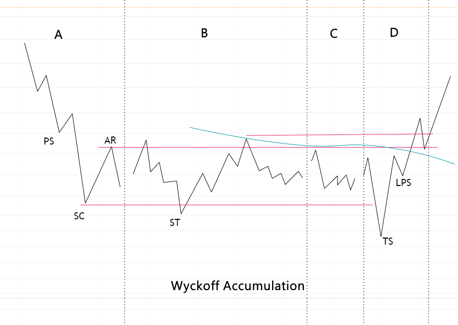
Followers of the Wyckoff Method divide the accumulation stage into 5 phases:
Phase A of Accumulation Stage
This phase occurs when the price decline comes to an end: news is negative, and the price drops to important lows on high volumes.
- PS — Preliminary Support. Sales volumes are extremely high, but the price is still far from being ready to move upwards.
- SC — Selling Climax. This is the moment when, after a prolonged downward trend, wide bearish candles appear on the chart, and trading volume shows an abnormal increase. These sales may indicate that retail traders are panicking and are eager to completely offload their assets.
- AR — Automatic Rally. This is a sharp price increase following panic sales, indicating that major buyers (the Composite Operator) are beginning to show interest in accumulating assets at lower prices.
Phase B of Accumulation Stage
This phase occurs when the price moves into a range and oscillates between support and resistance levels (marked by red lines on the chart above).
- ST — Secondary Test. This phase is characterized by tests of the support level. Sometimes, these tests result in false bearish breakouts (bear traps). This intensifies pressure on sellers, forcing them to sell off their assets, as they believe that the price drop will soon resume (though this does not actually happen).
Phase C of Accumulation Stage
In this phase of accumulation, it may appear that the market has calmed down: trading volumes decrease. However, this does not mean that the Composite Operator has lost interest — rather, they are waiting for the right moment to take the next step in their campaign.
Phase D of Accumulation Stage
In this phase, it is common (though not always the case) for the price to make a false downward movement.
- TS — Terminal Shakeout. This movement is aimed at “shaking out” assets from retail traders who mistakenly assume another reversal breakout has occurred. They start closing their positions at stop-loss orders just before the beginning of an upward trend. Following this, the price begins to rise on increasing volume (indicating demand activity).
- LPS — Last Point of Support. The price declines slightly, but on low volumes, showing that selling pressure is already minimal. This is the main moment for the Composite Operator to enter positions in the accumulation, with little supply in the market to resist the impending upward trend.
During this stage, a “Jump Over the Creek” may sometimes be observed, where the “creek” is a vague resistance line within the accumulation (marked on the chart above as a dashed line).
Example of Accumulation Using the Wyckoff Method
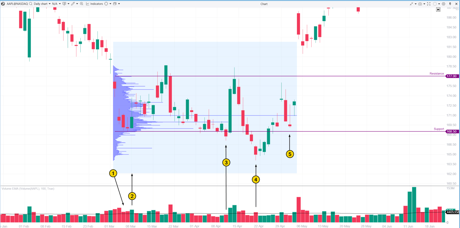
An example of the accumulation phase of an asset according to Wyckoff can be seen in the situation that developed on Apple’s (AAPL) chart in the spring of 2024. The Composite Operator actively accumulated positions in AAPL during this phase, despite a negative news backdrop surrounding the company related to new regulatory actions on the App Store, which deterred retail investors and increased the supply of assets for accumulation.
Logic of the Wyckoff Method
The Chart Contains Everything Needed
Wyckoff argued that all the information required for making trading decisions is already reflected in prices and trading volume, as displayed on the chart (at that time, charts were drawn by hand). The advantages of this approach are:
- The chart consolidates all transactions, providing a sort of summary report;
- The chart is reliable and serves as an accurate source of actual exchange information;
- The chart allows for real-time analysis (to the extent that this was feasible in the 20th century).
The Composite Operator
Wyckoff believed that different groups of large players often act in a similar way without coordinating with each other. He introduced the concept of the Composite Operator into his method—a hypothetical market participant that represents those who can influence the market with significant operations.
Three Key Laws of the Wyckoff Method
To interpret price and volume charts, Wyckoff used three laws:
- The Law of Supply and Demand. This law defines the direction of price movement based on the balance (or imbalance) between buyers and sellers.
- The Law of Cause and Effect. This law suggests that a price increase is a result of prior accumulation of the asset by the Composite Operator. Similarly, distribution is the cause of a subsequent price decrease.
- The Law of Effort vs. Result. This law analyzes the relationship between trading volumes (effort) and price movement (result) to evaluate the successes and failures of market participants, which helps to understand the prevailing sentiment in the market.
Characteristic features of the price growth stage:
- Breakouts of resistance levels. These often occur with bullish gaps and increased volumes, which confirms demand.
- Testing. If price declines do occur, such candles are accompanied by insignificant volumes. This way, the Composite Operator assesses the available supply of the asset in the market. If the supply pressure is low, it can signal readiness for further growth.
- Market psychology. At this stage, growing optimism and expectations of further growth prevail, attracting more participants to purchase the asset, which becomes increasingly scarce.
Example of the price growth stage according to Wyckoff
As an example of the price growth stage of an asset based on the Wyckoff method, let’s consider another chart of Apple (AAPL) stock as of mid-2023.
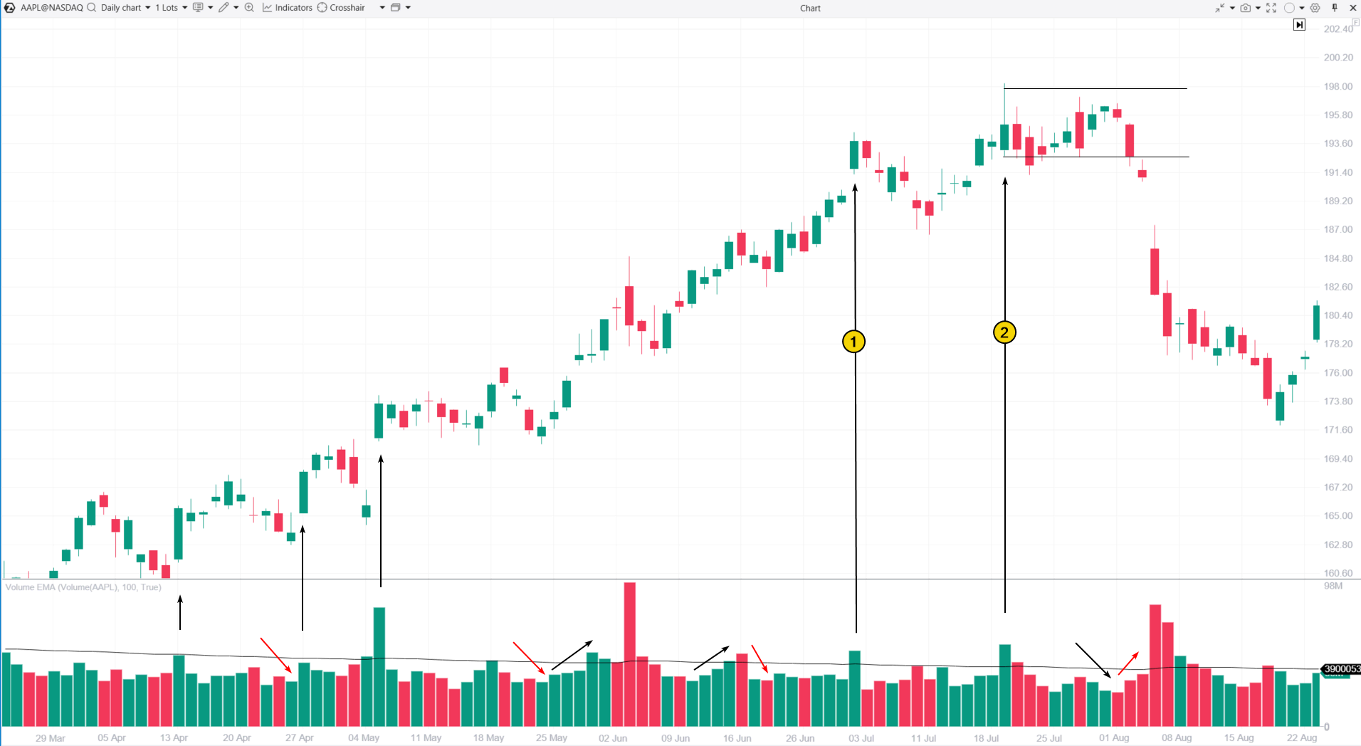
The left part of the chart shows:
- Rally. Black arrows indicate price increases accompanied by rising volumes.
- Reactions (or corrections). Red arrows indicate price declines during which trading volumes decreased. Weakening trading activity as prices fall in the Mark Up stage generally indicates that fewer sellers are ready to part with their assets at lower prices.
The right part of the chart shows signals that should alert an analyst using Wyckoff’s method to assess price and volume behavior:
- A strong bullish candle with a gap and increased volume looks optimistic, but the subsequent deep reaction is a sign of weakness. This shows that sellers are defending the price at the available peaks.
- Another growth attempt that makes no progress.
These points emphasize the importance of analyzing the interaction between price and volume (price rises – volume decreases, price falls – volume increases). This is a sign of a bearish market and a reason to believe that the Composite Operator distributed shares around the $190 level, intending to close positions. This may be reinforced by the influx of retail buyers, driven by positive news that Apple had become the first company to reach a $3 trillion market capitalization.
Let’s explore the distribution stage in detail using the Wyckoff method.
Distribution
Distribution is essentially a mirrored reflection of the accumulation (buying) stage.
The Composite Operator systematically distributes assets, capitalizing on optimistic news to completely or partially sell their shares to retail buyers.
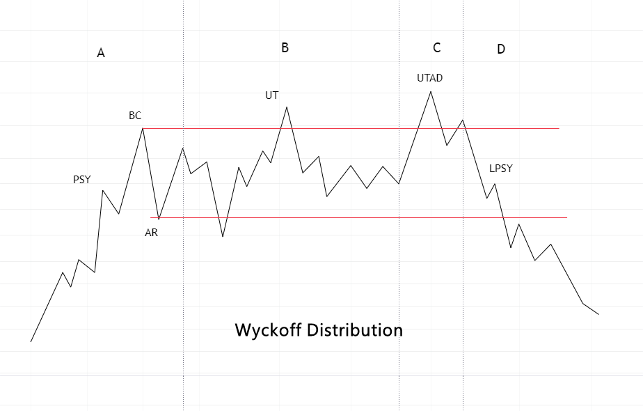
In Phase A, the news is very optimistic, and the stock price rises with large gaps, often surpassing psychological levels. This attracts a broad mass of buyers, leading to a Buying Climax (BC).
Signs of selling activity from the Composite Operator appear as follows:
- Price drops after PSY (Preliminary Supply, or Preliminary Resistance). For example, refer to Figure 1 in the AAPL chart above.
- Automatic Reaction (AR) after the climax.
In Phase B, the market usually calms down. If the price fails to break through the local support and resistance levels (marked with red lines on the distribution chart), the trend continuation does not occur.
- UT — Upthrust: a false breakout after the climax, which lures more retail traders into buying — a classic bull trap.
Phase C is characterized by a final false breakout after the climax, known as Upthrust After Distribution. This is a mirror reflection of the Terminal Shakeout — the maneuver that completes the accumulation stage.
This is followed by Phase D. The price declines on reducing volumes, and short-term peaks form LPSY (Last Point of Supply).
It’s recommended to read the article “Upthrusts and Shakeouts” for a better understanding of these concepts. Now let’s provide an example of Wyckoff’s distribution.
Example of Distribution Using the Wyckoff Method
The following example demonstrates that Wyckoff’s distribution scheme applies not only to stocks but also to cryptocurrencies. The chart illustrates a significant peak in Bitcoin, which formed in the fall of 2021.
This was a period when a Bitcoin ETF was approved, and analysts predicted BTC/USD prices over $100K. Bitcoin received support from the heads of Apple, JP Morgan, and even George Soros and other big players. Moreover, El Salvador became the first country in the world to officially adopt Bitcoin as a legal tender.
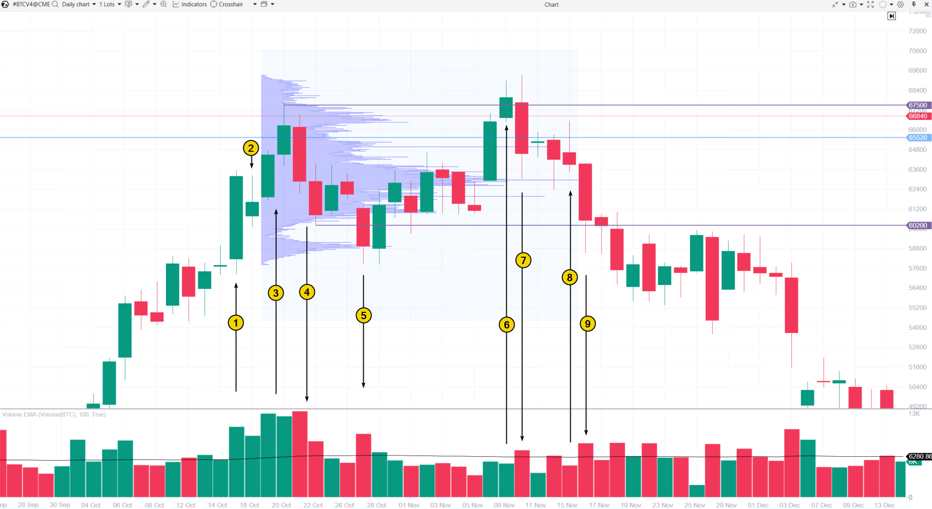
A large influx of positively-minded buyers allowed the Composite Operator to “offload” their assets:
- Price growth accelerated, attracting FOMO buyers.
- Trading volumes rose, with one candle closing far from the peak. This indicates PSY (Preliminary Supply).
- In the next two candles, the climax of buying occurs. Volumes are twice the average, and the price surpasses a psychological threshold or an important previous record (the blue line).
- Automatic Reaction, which indicates the power of sellers entering the market, as they are standing against the wave of FOMO-driven demand.
- A local support level is tested but not broken. The price is not yet ready to fall, as the Composite Operator needs more time to distribute Bitcoin (or other assets) accumulated earlier at a lower price.
- Upthrust.
- We observe a price decline, which is particularly important as it happens on decreasing volumes.
- Last Point of Supply. The price rises for two days, but demand is low.
- Further price decline and the start of the Mark Down phase, in which Bitcoin drops below $20k.
The profile shows that a large volume of sales occurred around the $63k level. This was the average price at which the Composite Operator distributed the asset among anxious buyers.
Downtrend (Price Decline Phase)
The price decline phase is a period when the initial excitement gradually gives way to apathy, depression, and eventually to panic.
Rules of the phase (with possible exceptions):
- The price rises on decreasing volumes;
- The price declines on increasing volumes;
- Past support levels turn into resistance, and these levels take on the role of resistance;
- Breakouts of resistance levels are unsuccessful;
- Failed tests of support levels;
- A downward trading channel forms on the chart.
Example of the Mark Down Phase
The chart below shows an example of what Wyckoff’s methodology calls the price decline phase. This example uses oil futures.
In early 2024, the oil market faced growing tensions as leading news agencies reported:
- Israel has launched an airstrike on a diplomatic building. Escalation of the conflict could lead to a global energy crisis.
- Numerous American and multinational oil refineries in Russia are affected.
- OPEC+ is considering lowering production quotas.
As a result, a distribution range between 85 and 87.60 formed on the chart.
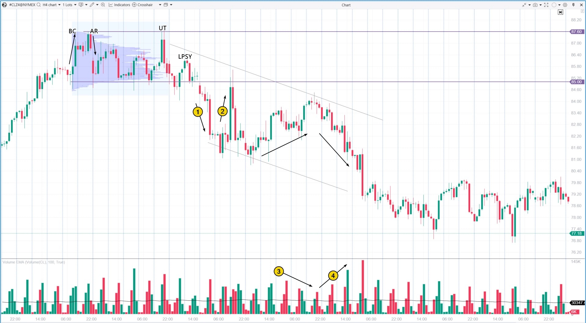
Then the Mark Down phase began, forming a descending channel:
- Accelerated decline on increasing volumes.
- Failure during an attempt to rise. The price tests high-volume levels formed during the distribution phase.
- The price rises on decreasing volumes—a sign of weakening demand.
- The price declines on increasing volumes—a sign of supply pressure.
777777
BT
![]()

