WHAT IS A HEAT MAP AND WHY DO YOU NEED IT?
⇒ Warning. Any strategy does not guarantee profit on every trade. Strategy is an algorithm of actions. Any algorithm is a systematic work. Success in trading is to adhere to systematic work.
A heat map is a way to display activity in the DOM over time. The brighter the color of a price level on the chart, the larger the volume of limit orders placed at that level in the DOM.
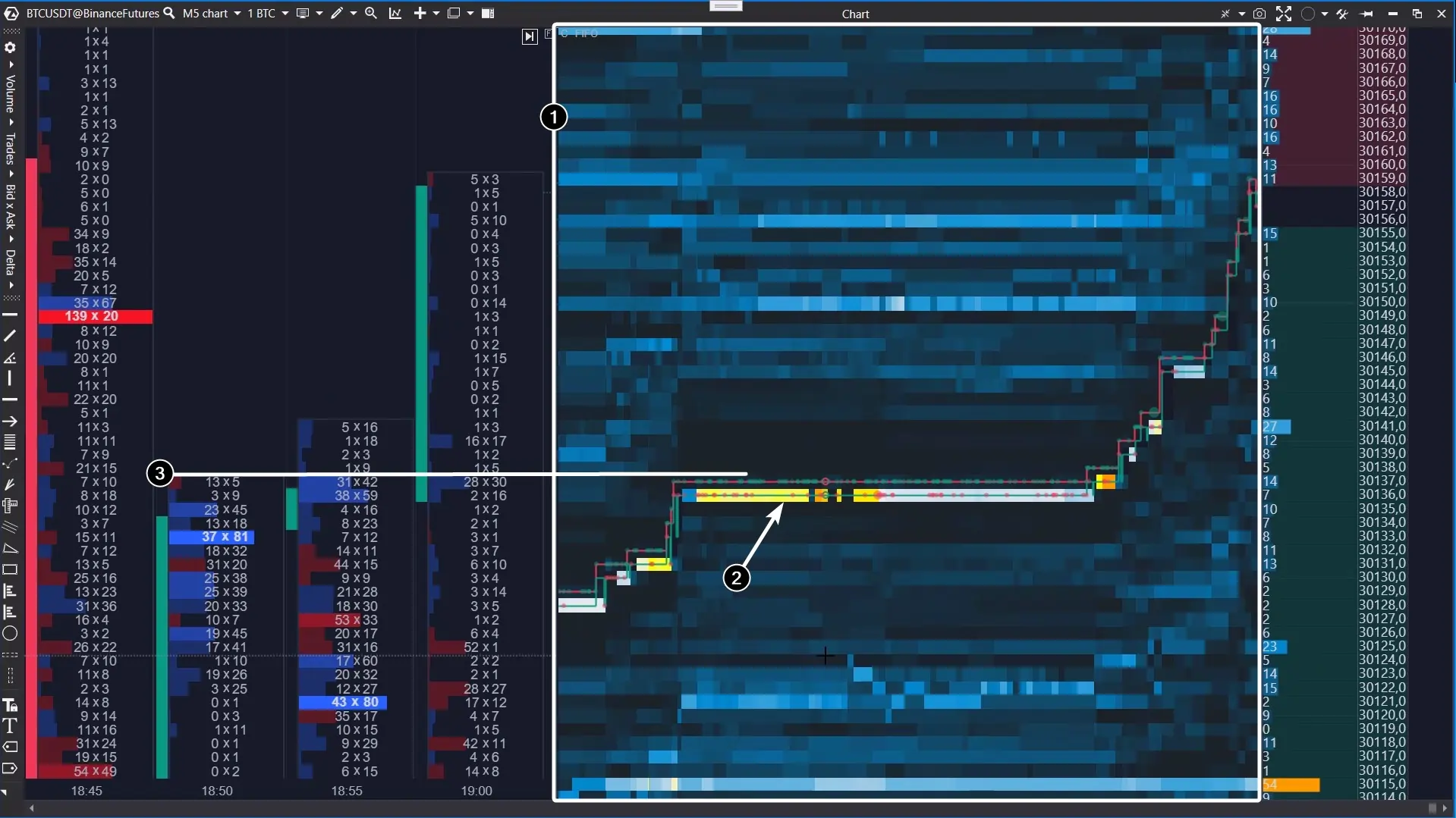
The above screenshot demonstrates the Scalping DOM indicator with the heat map in action (1).
- dark blue cool colours correspond to low volumes in the DOM;
- yellow and orange shades indicate high volumes that are likely to reveal the interest of an important market participant.
Analyzing the heat map, you can notice the activity of a limit buyer (2). Apparently, this is a major player’s robot buying up assets at a breakout of the local resistance level (3).
This is just one of many examples showing how a heat map can be an easy and useful instrument for tracking the actions of big players in order to uncover their intentions and get some ideas about directions that the price will move.
Use the heat map in ATAS indicators for:
- scalping;
- finding more accurate entry points – minimize the risk;
- learning – study the markets safely in the Market Replay mode, use the heat map to track the behaviour patterns of big players in the DOM.
ADVANTAGES OF THE ATAS HEAT MAP
- Accuracy. Its readings are based on tick data coming from exchanges (and stored on ATAS servers).
- Flexibility. In the settings, you can specify in detail the parameters of the colour scheme, contrast, and others.
- Optimization. Launching the heat map does not heavily load system resources. The playback and centring occur smoothly.
- Built-in navigation. If necessary, you can move the map up/down, left/right with your mouse, as well as quickly return to the right edge.
- Beauty. No comments are needed 😉
SCALPING DOM – HOW TO RUN IT, SETTINGS OVERVIEW
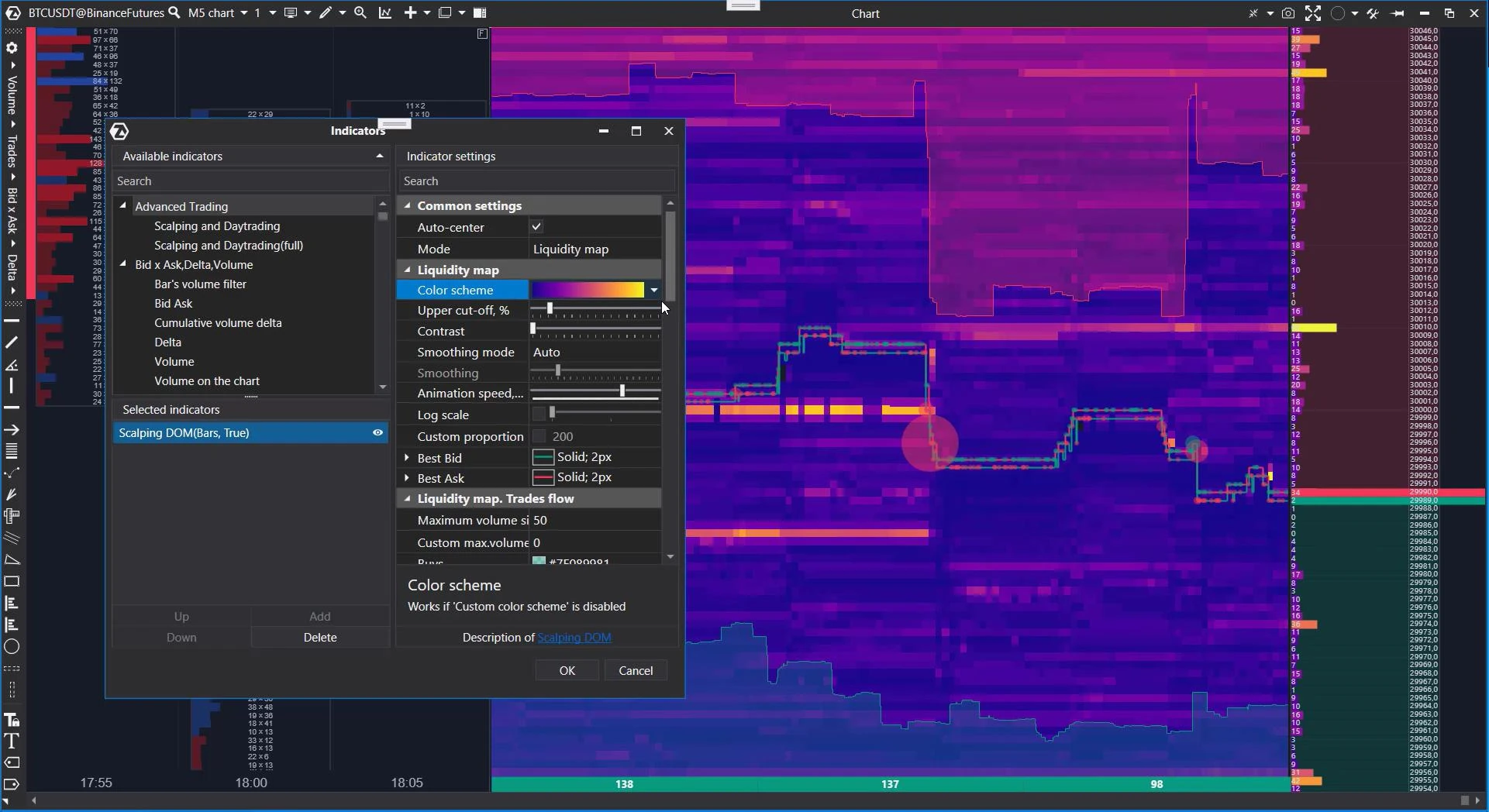
Open the indicator manager (Ctrl+I, or click on the corresponding icon in the top menu of the chart module) and add the Scalping DOM indicator to the chart of the selected instrument.
A brief description of the heat map settings:
- Colour scheme: select a colour gradient.
- Cut-off: “cut-off” setting at the bounds of the heat map.
- Contrast: the “sensitivity” setting allows you to hide minor levels.
- Smoothing mode: adjust smoothing (manual or automatic) to select the desired degree of detail in the levels.
- Animation speed: set how fast the map’s state changes.
- Log scale: setting the proportionality of level drawing on a classic or logarithmic scale.
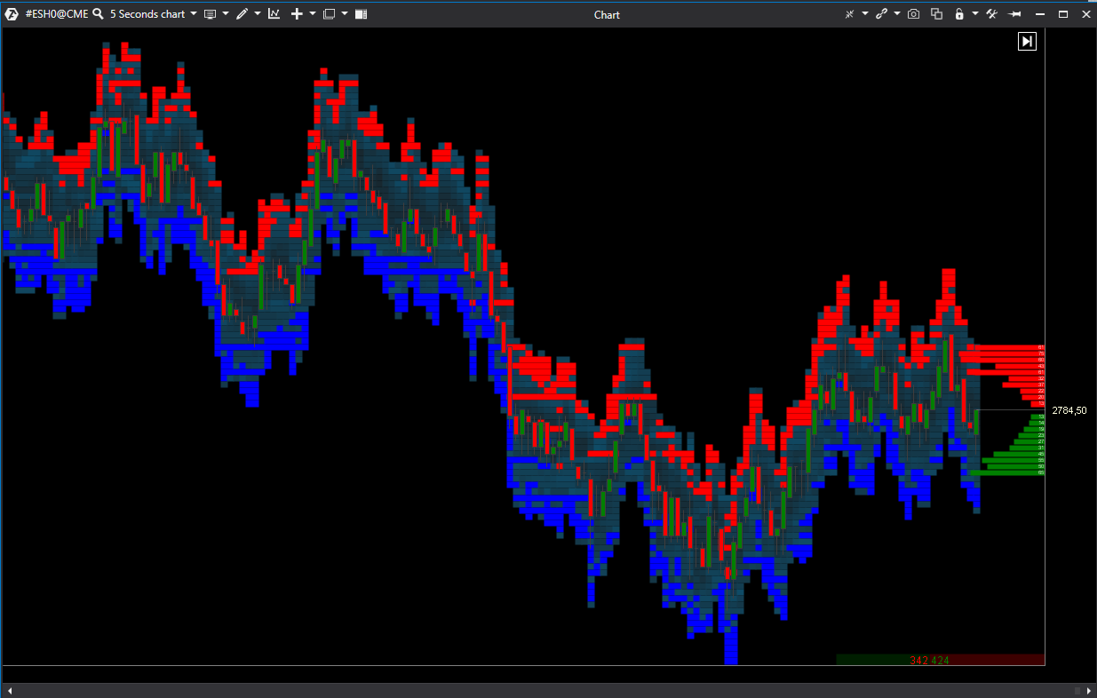
The indicator view in the chart:

*Besides, when hovering over the indicator marker, it is possible to see data values in the DOM at a particular level at a certain moment.
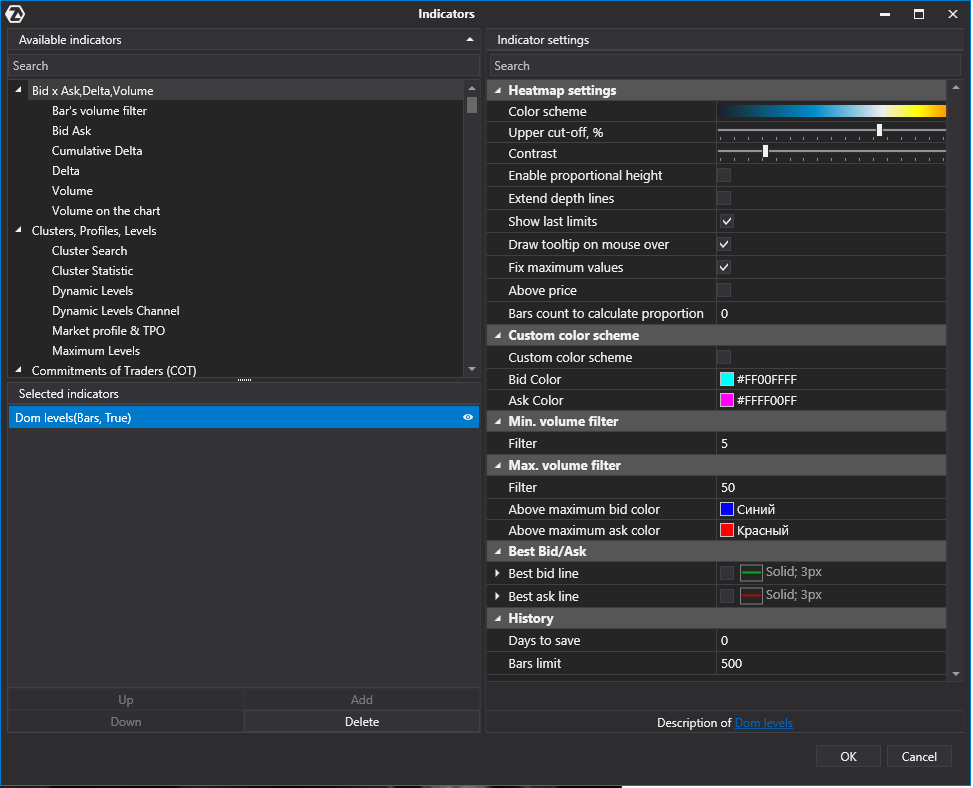
It is necessary to open the Indicator settings window for adding and setting this indicator.

Indicator settings
Heatmap settings
Color scheme –setting of the volume value visualization in the indicator.
Upper cut-off, % –let’s assume that the maximum volume=1000 in the visible range.
Also we assume that there is a volume 800 level.
If the cutoff=0, this level’s color will be calculated as 80% of the maximum color in the gradient.
If we set the value 20%, the maximum volume is 1000-20%=800. In this case, the volume 800 level will be highlighted with the maximum volume color.
Contrast – allows to filter levels from lowest to highest. The greater the contrast, the less weak levels will be visible.
Enable proportional height – activates the display of levels in proportion to their value.
Extended depth lines –extends levels from the current price to the price scale.
Show last limit – displays inactive volume levels in the chart.
Draw tooltip on mouse over – when hovering over the indicator marker, it is possible to see data values in the DOM at a particular level at a certain moment. This function is disabled when the checkbox is unchecked.
Fix maximum values – when this option is enabled, the indicator will remember the maximum volume which was at the level during the candle forming and display it, it won’t display the volume which will be at the moment of candle closing.
Bars count to calculate proportion – if the value is “0”, the color settings proportion is calculated among levels which are visible in the chart. If it’s necessary to calculate the color gradient on a larger part of the history than is loaded in the chart, specify the required number of bars.
Custom color scheme
Custom color scheme – activates the custom color scheme.
Bid color – bid color in the chart.
Ask color – ask color in the chart.
Min. volume filter
Filter – minimum volume value
Max. volume filter
Filter –maximum volume value
Above maximum bid color – select the color for bids which are higher than the specified filter.
Above maximum ask color – select the color for asks which are higher than the specified filter.
Best Bid/Ask
Shows the best Bid and best Ask lines
Best Bid line – enable/disable the best Bid line
- Color
- Line style
- Width
Best Ask line – enable/disable the best Ask line
History
Days to save – number of the indicator marker history days to save.
Bars limit – limit of bars on which the indicator is displayed.
BT
![]()

