WHAT DOES A TEST MEAN IN TRADING?
⇒ Warning. Any strategy does not guarantee profit on every trade. Strategy is an algorithm of actions. Any algorithm is a systematic work. Success in trading is to adhere to systematic work.
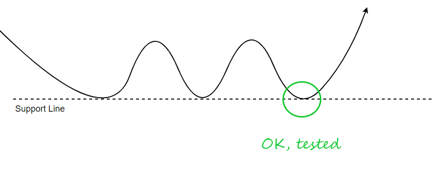
Usually, a test in trading means a price reversal from some object on the stock chart:
- a previous low/high;
- a support/resistance level;
- lines of a moving average or other indicator.
It is believed that in this way the market receives confirmation that the object, which is being tested, continues to work. For example, if the price has tested a support level, the market has made sure that the level continues to function in its role.
But why is it called a test? If you think about the meaning of the word “testing”, you may have some questions.
How can an inanimate price test an intangible moving average, and also draw some conclusions?
A person can literally test the bottom of the lake before going swimming or test water for salt when making soup. But what information does the market read from the price action in order to be sure of something? And what is the mechanism of influence on the further course of events?
Let’s think about it and have a look at some examples.
EXAMPLE 1. VSA TEST
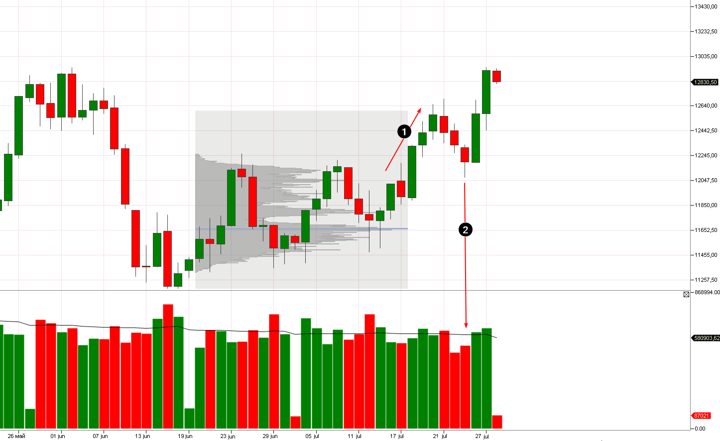
This is NQ daily chart for 2021.
After a period of consolidation (indicated by the market profile), the contract price went up (1).
Buyers had the upper hand. Major traders, that could influence the price, were probably among them. But when the price rose to 12640, it came close to the resistance zone around 12800 which can be built from the tops on the left side of the chart. What could a “collective buyer” think?
Should I buy below the resistance level? This may not be a good idea as sellers may be strong and become even more active if the price rises. And then, if buyers start to absorb sellers’ limit orders, they can fall into a trap and suffer big losses.
What should you do? Check (test) the activity of sellers. If the price goes down, sellers should become more active because they will think that a new bearish trend is starting.
This is how candle 2 can be interpreted. Its volumes are below average, which indicates that sellers are passive. Therefore, buyers gain confidence before the breakout of the resistance level. They have tested the sentiment and made sure that the market is more bullish than bearish.
As a natural consequence, we see bullish candles on above-average volumes after the test (2). A “collective buyer”, headed by major traders, is sure of attacking the resistance level and does it boldly.
The reasoning described above is an example of Tom Williams’ logic (the creator of the VSA strategy). In this case, he would surely call the candle number 2 a test of offers.
Williams himself admitted that such tests are the most preferable setups for him to enter a long position.
EXAMPLE 2. TESTS ON MONDAYS
According to the VSA analysis, testing has meaningful logic because one can reasonably formulate a hypothesis after reading the chart:
- What is being tested? – Sellers’ activity.
- Why? – To find out the market sentiment.
- In what context? – Before the breakout of resistance.
But the motive and context for testing the offer may be different. For example, to find out the market sentiment not before the breakout but after a pause on the weekend.
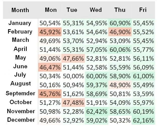
Stock market maven and VSA creator Tom Williams said that he often watched tests of supply on Mondays. Major traders sell stocks on these days to force a decline in price and see what happens:
- If stocks decline slightly and there is a revival in demand that will restore prices, the market is dominated by bullish sentiment. Therefore, it is wiser to trade on the bulls’ side at the beginning of the week.
- If there is a revival of sellers and it increases negative dynamics of the price, there will be low demand on the market. Trading on the bulls’ side may lead to losses.
It is curious that statistics from the 1950s show the worst dynamics of the S&P index on Mondays.
EXAMPLE 3. VSA TESTS ON A CLUSTER CHART
Tom Williams usually used daily charts, but tests of supply can also be found on an intraday scale.
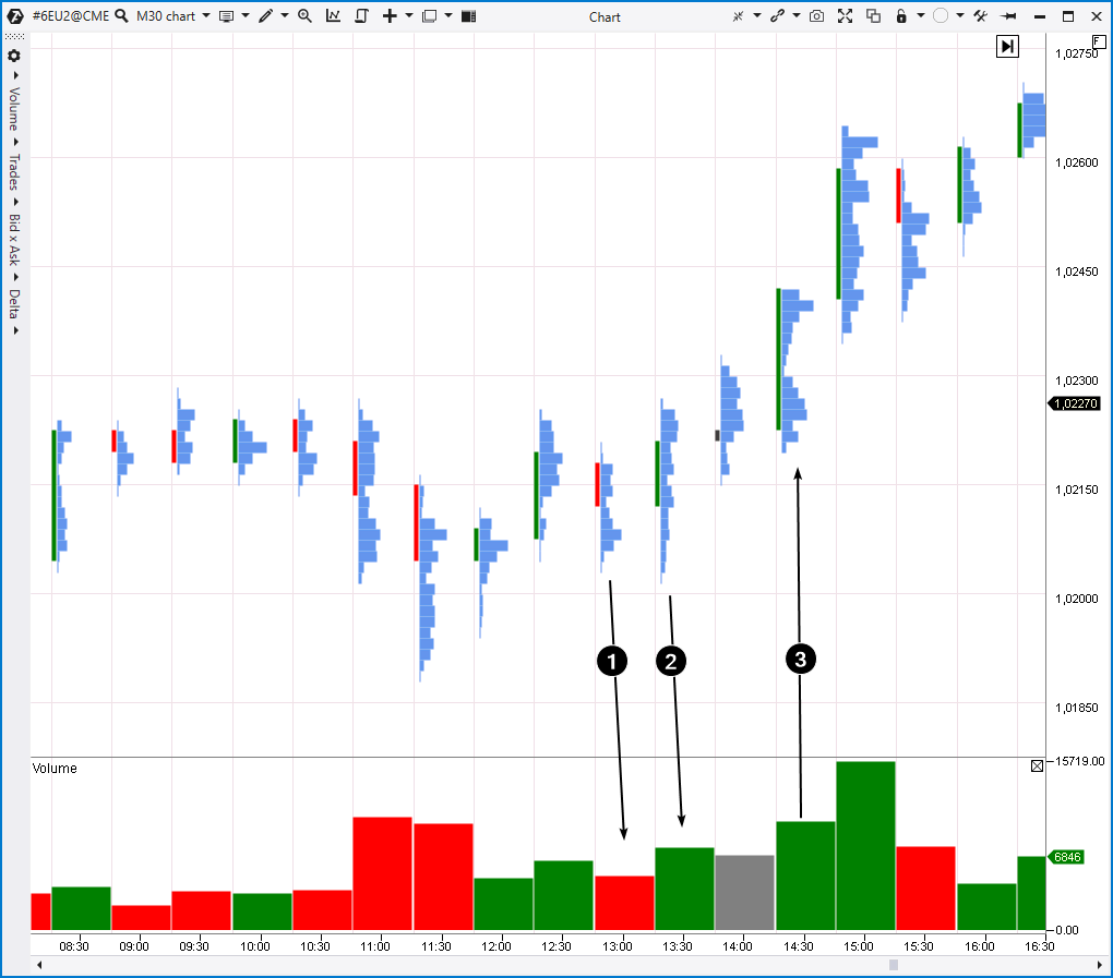
Let’s take the euro futures, 30-minute chart.
Looking at the left side of the chart, you can make an assumption that the 1,023 level works as a resistance. If a buyer intends to move the price higher, it is important to know the sellers’ strength at the 1,023 level because this is what should be overcome.
Candle number 1 gives the buyer valuable information. The quote was going down, but the overall volume was low and the closing price was in the middle. The bulge on the profile can be interpreted as positions of sellers locked in a local trap. It is unlikely to indicate their strength.
Candle number 2 has a very thin profile at the bottom, which means that the market is not interested in lower levels. But the thickening of the profile at the top of candle number 2 looks like the activity of buyers who believed that bears were passive.
Candle number 3 is a breakout candle. The buyer “pushed through” the 1,023 level. The candle closed at the highs. A thing that could have contributed to it was a short squeeze which happened due to buys of those who closed short positions by a stop-loss above the 1,023 level.
At 15:00, buyers achieved success but its prerequisites could be seen 2 hours earlier when testing the offer as part of the VSA analysis.
EXAMPLE 4. TESTING THE PANIC SELLING ZONE
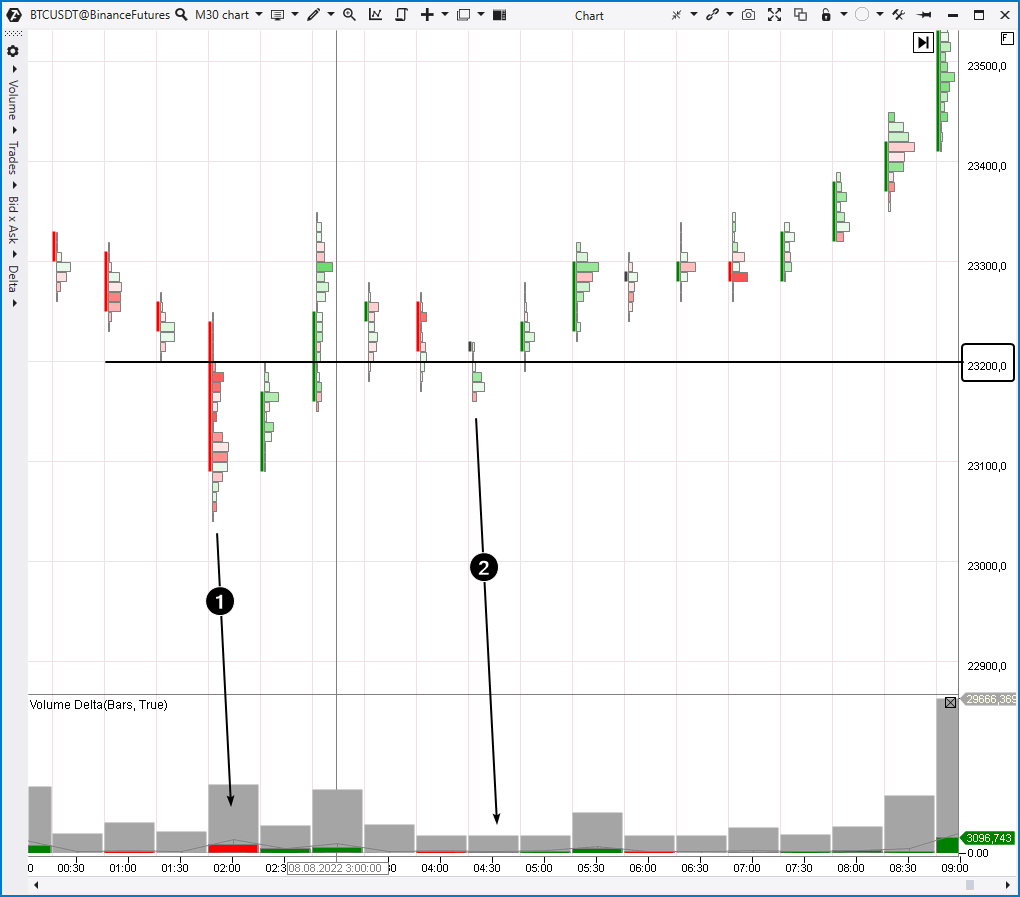
Let’s have a look at the cryptocurrency markets. The screenshot below shows a cluster chart from the Binance Futures exchange showing the trading process of a Bitcoin futures. The red-green clusters show delta at each level. There is the volume indicator (gray bars) at the bottom of the chart, it is combined with the vertical delta indicator (red-green bars) in the minimization mode.
When the price moves below the 23200 level, it is easy to notice red clusters and a general negative delta on the vertical bar (indicated by number 1).
However, there was a restoration on the next candle. The spike in the negative delta was driven by panic selling activity and/or by triggering buyers’ stop-losses. Anyway, these sells do not provide any arguments that sellers have power and control over the market.
When an intermediate top formed around 23350, there was a decrease and another crossing of the 23200 level. However, the volumes were low for the second time, so we do not see panic or vast spikes of delta.
How to interpret such a picture?
In our opinion, there was a test of panic selling. The first candle triggered sellers’ activity which was “absorbed” by buyers. Major traders were probably among them and they knew that 23200 is a good price to buy bitcoin. Intentionally or not, they used a spike in panic selling to go long on their account expecting a rise.
Candle number 2 could be a test of panic selling. The minimum and maximum of the candle were below the previous 2-3 candles. At 04:30 we observe a feeble attempt to decrease. Low volumes revealed that sellers were passive. Everyone who wanted to sell had already done it. The buyer received confirmation of their rightness.
In other words, the analysis of volumes shows the capitulation of sellers. The buyer accumulated long at their expense and, thanks to the test, received actual confirmation that the job was done. The supply was exhausted and the market had more chances to rise intraday or positionally.
BT
![]()
